Bamboo Spark, collaboration and hand-lettering by Amelia Cheung

Exciting times! Check out the video above posted by Wacom and directed by Rodd Chant.
We recently had the opportunity to talk about how important design collaboration is at Elmwood, specifically how we are able to work across offices and to share ideas spontaneously.

It was also an awesome opportunity to show off a bit of hand-lettering with Ning and Sam, which the Bamboo Spark helps convert from good ol' fashioned, tactile pen-and-paper sketches to digital media on the ipad or phone.

Fun piece of technology and very affordable – it's not just for the creatives, but also for the note-taker in everyone!

The Devil... by Amelia Cheung

The Devil is in the Detail(s)

The Devil is in the Detail(s)

I was excited post #36daysoftype to get back to hand-lettering full words as opposed to drop caps, and so I had fun with the design quote for work's instagram feed. However, someone rightly pointed out that the correct usage of the phrase / idiom is "The Devil is in the Detail". No plural. How ironic...

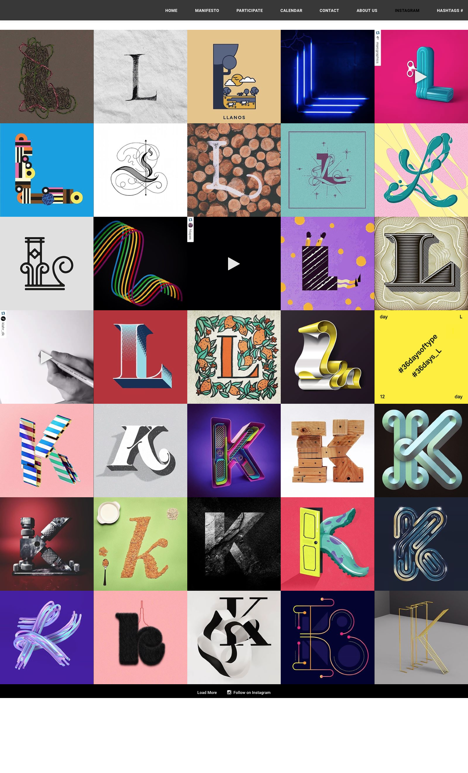
#36DaysOfType2016 by Amelia Cheung

Decided to take part in the 36 Days of Type series on Instagram with the cool kids at work, and so far it's been an exercise in finding any spare minute of the day outside of work to complete them. It's a real commitment! But it's a great forum and really inspiring to see such creative output. There's such variety, from calligraphy to illustration, and 3D to animation.

An awesome thing happened at letter L, I got featured by the @36daysoftype feed!


Check out the feed here

Stacie Jackson Ltd by Amelia Cheung

Scan of a trace, of a scrawl, in dip pen and ink

Scan of a trace, of a scrawl, in dip pen and ink

I responded to a call from my friend for a logo for her events management business. Well – technically it was a text and an Instagram comment, but I responded nonetheless as she has a good name for a scribe – rhythmic letters!

After doing a few different versions and testing out the flourishes, I scanned in the best one and proceeded to manually trace the letters to smooth and even out the letters. I still wanted the handwritten feeling but needed the cleaner lines for scale and application. She's also a very organized person being an event planner, so I didn't want to give off the hippy artiste vibe.

This is a work in progress!

Jacqueline de Ribes @ The Met by Amelia Cheung

Cool for the summer, as Demi Lovato would sing...

Cool for the summer, as Demi Lovato would sing...

Managed to catch the Fall 2015 fashion exhibit of Jacqueline de RIbes "The Art of Style" by the Costume Institute at The Met before it closed. That lady has style!

The exhibit included many custom designed couture pieces (Christian Dior appears many times as a close friend) as well as pieces from her own collection. One room featured her amazing over-the-top costumes for masquerade parties and balls – epic details!

Loved her style, use of colors and many of the pieces would be on a runway even today – the true meaning of classic and timeless. 


My Valentine by Amelia Cheung

Here's the final card!

Incorporated some classic Village architecture with the tenement buildings to tell the story of neighbors reaching out to neighbors in my local hood.

Check out the site for more pics!

And here's the website if you want to get involved :) visitingneighbors.org

Sending love by Amelia Cheung

The ethos behind Visiting Neighbors since 1972

The ethos behind Visiting Neighbors since 1972

A new project at Elmwood celebrates charitable and philanthropic organizations on Valentine's Day by sending them a personalized love note or postcard designed specifically with their cause in mind. The idea was to connect with the community as well as an opportunity to attract potential pro-bono jobs.

The thoughtful idea drummed up by Sam B encourages everyone in the studio to think of a charity they want to dedicate their card to, along with a money donation to their cause.

I chose to dedicate my card to Visiting Neighbors, a Senior Care organization who are local to me, where volunteers who visit elderly neighbors to help maintain their independence by escorting seniors to and from appointments or the grocery store, all while getting to know each other.

It's something I am looking to volunteer to doing myself (I love the wisdom of the elders!) so it seemed perfect. The finished cards will be sent out soon for Valentine's Day, so I'll post the finished card when it's out in snail mail!

Seasons Greetings by Amelia Cheung

This year to put the new calligraphy skills to the test and have something to practice on, I picked some fun Christmas lyrics from songs and carols to scribe. Everyone groans when the holiday music comes on since it's been the 100th time they've heard it on loop over the years, but everyone knows the words to the classics!

The holidays is the universal time when everyone sends snail mail, so there's nothing better than seeing someone's joy and surprise that the card has a handwritten message AND is also homemade.

To add a bit of color and festivity to the cards, I purchased a watercolor and gold swatch pack from Creative Market called Liquid Gold for Illustrator, which added to the hand-created feel and saved a lot of time. Painting and scanning watercolors lose a lot of the subtleties when reprinted, so this way I could create some simple patterns and splatter shapes for scanning, yet color them through these bought color swatches. Gives me more time to practice the lettering instead!

The 5 designs were printed via moo.com who did a great job with the digital printing. I bought a larger pack to use the sets as Christmas gifts as well as sending out individually – they were a huge hit!

Now I'm looking forward to finishing off my Greetings card collection I started last year with Tombow Brush pens. Watch this space!


Type Tuesdays Continued by Amelia Cheung

Sam and Ning making this calligraphy business look good

Sam and Ning making this calligraphy business look good

Type Tuesdays is not just a popular hashtag on Instagram, it's a popular day of the week for the 3 of us who enjoy some Netflix and twirling some type out with pointed pen and ink.

It's been going on for about a year now and we've definitely improved! There's also a distinct style for each of us, and you can see above. From left to right, there's me, Ning and Sam. We like to switch it up from traditional calligraphy nibs with ink to tombow brush pens, each requiring a different discipline and muscle memory. There's something so satisfying and immediate to making something by hand when you spend all day staring at a screen. I highly recommend it as recreational therapy – get doodling people!

Giving Thanks – Work In Progress 2 by Amelia Cheung

Currently working on a Thanksgiving mailer and one of the ideas I worked up was this cute little message – Thanks Berry Much! I can't take the credit for the comical copy writing (thanks berry much Ning!) but I did enjoy have more words to play with on this rough sketch. I've found the amount of words, the length of the words and having a good distribution of letter forms gives you more opportunity to create nice shapes and overall flourishes are more fluid.

Ultimately we went with something simpler that worked with the 3-sauce series, but this is definitely something I could rework into a greeting card for the future. Speaking of greeting cards, I have another project that I'll be sharing on here regarding those!

Until then, let's get excited that TG feasts are coming soon...

The new Whitney Museum of American Art by Amelia Cheung

During my Inspiration Day in May, I got the opportunity to visit the newly opened Whitney Museum in the Meatpacking District. The building itself is impressive, with several floors and decorated elevators to shuttle you between decades of American art, and an outdoor space per level.

I personally enjoyed the views from the outside more than the art within the walls, despite it being a nice space and curated with a nice flow. The art was a smorgasburg throughout the decades and various art movements, so there were some pieces that stood out to me. But knowing where the museum stands within that neighborhood and its scene, I wasn't convinced that I would be making too many repeat visits – perhaps opting instead for a walk on the Highline.

China – Through the Looking Glass @ The Met by Amelia Cheung

My parents came to visit me recently and I naturally took them to The Met (my favorite museum in NYC), but I had forgotten that the China wing was closed after the end of their summer fashion exhibit China – Through The Looking Glass. I had the opportunity to see this exhibit in May and loved it so much I went back again.

Initially I had feared that the theme of how China culture had influenced Western fashion would be a little cringe-worthy, cheesy or a pastiche turned out to be well curated and dramatic, displayed amongst the China section of the museum. It apparently ended up being in their top 5 exhibits for the Fashion Institute!

Among the various themes there was a calligraphy room featuring Chinese wall paintings and dresses by Coco Chanel which were inspired by the brush strokes. Not exactly accurate letterforms (!) but gorgeous dresses nonetheless. One day, I'll break out the chinese calligraphy brushes from my childhood and attempt to learn that again!

The Neon Museum – Las Vegas by Amelia Cheung

The Stardust Casino

The Stardust Casino

In the summer I got to take my first ever trip to Vegas with my dearest girlies – FUN!

It was the end of June and sweltering, so when I decided to visited The Neon Museum I figured I'd spare my friends the geekdom and go by myself early in the morning to avoid the heat. Phew!

Under an umbrella and with a cold bottle of water pressed against my cheeks, I got to tour the impressive display while listening to the guide talk of an era that I've romanticized and wish I could've seen for myself. The cost of making these neon signs, much less refurbishing them is astounding. The museum has to raise funds to lovingly restore the signs which can be visited on their night tours.

The stories behind the casinos, hotels and the mob who ran them are fascinating too. Highly recommend a visit to this place if you're ever able to tear yourself away from the bright lights of the "new" strip. Just make sure you don't go in the dead heat of mid-summer!

http://www.neonmuseum.org/

Faile: Savage / Sacred Young Minds @ Brooklyn Museum by Amelia Cheung

Ning glowing amongst the blacklit artwork

Ning glowing amongst the blacklit artwork

This summer I was really excited to see that Faile were going to be exhibiting at the Brooklyn Museum (and subsequently in Times Square with their prayer wheel). I was introduced to their work by a colleague of mine a few years ago and had attended the NYC Ballet x Faile Art Series in 2013 which was impressive and brought a younger crowd to the ballet.

FAILE, Brooklyn-based artists Patrick McNeil and Patrick Miller, exhibited The FAILE & BÄST Deluxx Fluxx Arcade, an interactive environment created in collaboration with Brooklyn artist Bäst that includes video games, pinball machines, and foosball tables, which according to the Brooklyn Museum is "a nostalgic nod to video arcades and punk rock and graffiti culture."

The exhibit which recently closed October 4th also featured FAILE's Temple, which was a life-size structure you could walk around, reminiscent of a ruined religious temple.

I loved the use of the museum space in a more kidult interactive way, almost an extension of a cooler Barcade which invited you to stay for a while and play (for free I might add). A lot of their work involves some sort of viewer participation – which almost distracts you from the great screenprints and decor that are created specifically for the show. I'm excited to see what they come up with next!

https://www.brooklynmuseum.org/exhibitions/faile

Dalton Maag @ Elmwood New York by Amelia Cheung

Lukas Paltram sharing the design process for the Amazon Paper White Kindle font

Lukas Paltram sharing the design process for the Amazon Paper White Kindle font

The Elmwood New York studio was lucky enough to have world-renowned type designer Bruno Maag come visit and give a talk on typography, fonts, and the time-heavy process that goes into creating them. The Dalton Maag founder and Austrian Creative Director Lukas Paltram shared some of their latest projects including digitizing the hand-script style of Lush soaps and beauty products, as well as redesigning the typeface for the Amazon Paper White Kindles.

He also shared insight on growing trends, creating typefaces for different languages, and his favorite typeface (Univers in case you're wondering!). We were able to share with them our own development in type with our New York based type illustrations hung in the back meeting room, which they were very encouraging and complimentary about – high praise from the masters indeed!

Bruno Maag schooling us on the history of type

Bruno Maag schooling us on the history of type

No Sleep Til Brooklyn, Bergdorfs & Bodegas, Fuhgeddaboudit, Lady Liberty

No Sleep Til Brooklyn, Bergdorfs & Bodegas, Fuhgeddaboudit, Lady Liberty

That Shit's Tight by Amelia Cheung

What weekends are for... Tasty coffee and lettering practice.

More posts to follow of my summer of inspiration – been getting out there to see exhibitions and getting outdoors. Now that summer is over, excited to get back to practicing, making and learning!

Mad Men Behind the Scenes – Museum of Moving Image by Amelia Cheung

I loved Mad Men. Who doesn't? The era, the ad agency world, the glamor and of course the dark and twisty Don Draper. Swoon.
To coincide with its recent series finale, the Museum of Moving Image in Astoria opened its exhibit celebrating all the magical parts of the show – from real sets to the actual writer's room, down to the props and wardrobe (Joan's dresses – oh my!). There was even a cabinet with purpose-made packaging recreated from vintage ads to give the sets their authentic feel. Geek out!

Since I had arrived early doors and was on my own, I was able to sit and watch the entire show reel of Matthew Weiner – the show's creator – who talks through some of the memorable scenes from each of the 7 seasons. If you're following the flow of the exhibit it's one of the earlier stopping points and well worth watching. It'll get you excited for the rest.

On until September 6 – go see it!

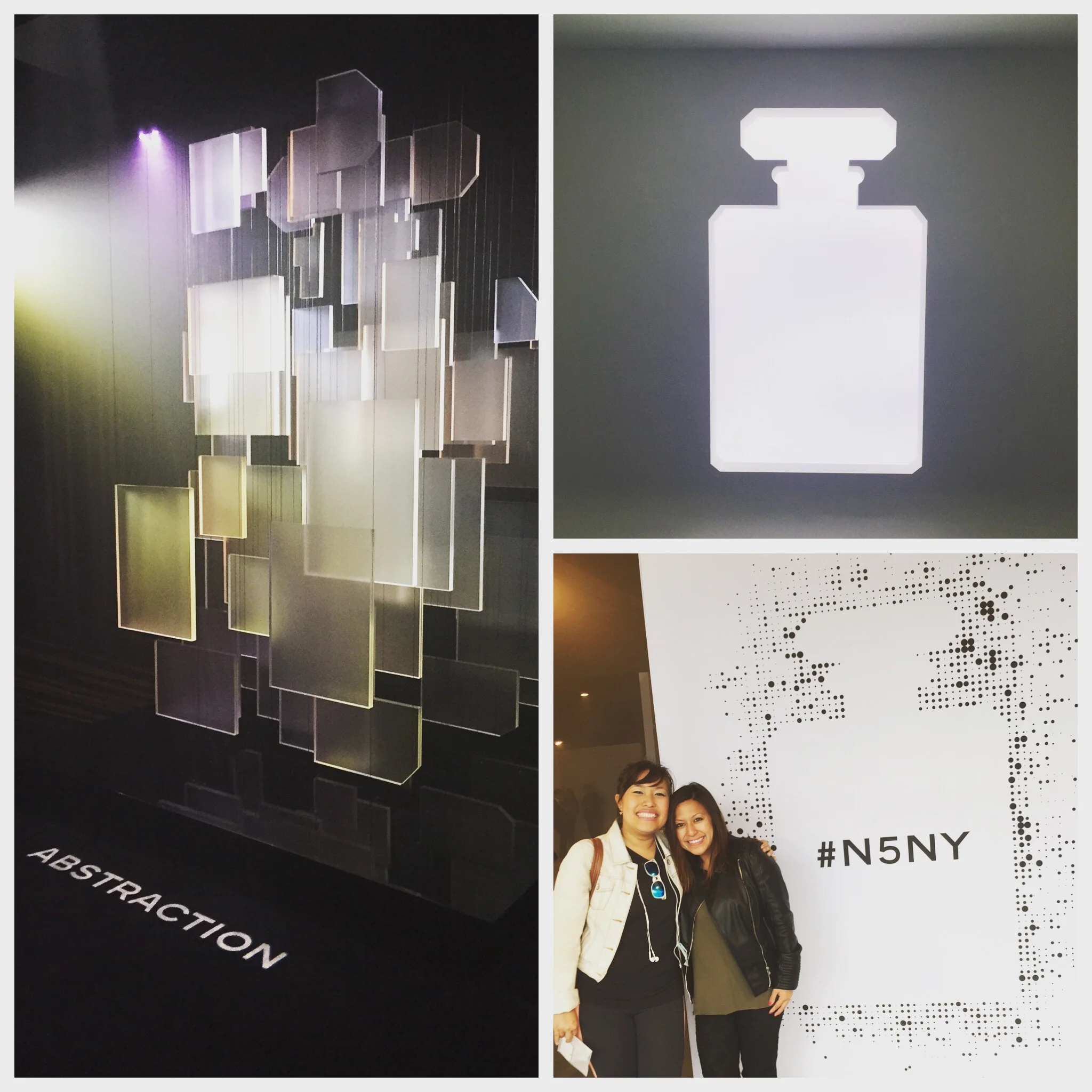
Chanel No.5 'In A New Light' Pop-Up Exhibit by Amelia Cheung

N5NY

To mark the launch of a new Chanel No.5 fragrance, Chanel held a week-long pop-up exhibit – "No. 5 in a New Light" in the Meatpacking District. The scent is 94 years old!

It was an innovative and multi-sensorial experience to say the least! An interactive tour into the world of the fragrance lasted 10mins and involved smells, sounds and the best part – a motion sensor interactive screen that resembled a pool of water with rose petals. A wave of the hand revealed quotes or information.

To add to the fun, I bumped into the lovely lady Nicole Torrecampo, who I discovered had produced the event for Chanel and was there overseeing the many people visiting. Bravo!


Yoga + Words of inspiration @ ABC Carpet by Amelia Cheung

DrinkYourTea

Recently had the pleasure of taking a yoga class with my good friend and newly qualified yoga instructor Minty [http://movemintnyc.squarespace.com/] at ABC Carpet with Elena Brower [http://elenabrower.com/classes].

The class was challenging and rewarding, and was set in a beautiful room on the mezzanine level of the store. Anyone familiar with the iconic interior / furniture store will know how beautiful and delicate their design aesthetic can be, and this yoga room was no different.

I was taken by the quotes on the wall with mini stories and words of wisdom, all done with brush calligraphy. A blend of East and West complete with sand art and deities. Really inspiring space, go take a class if you can!